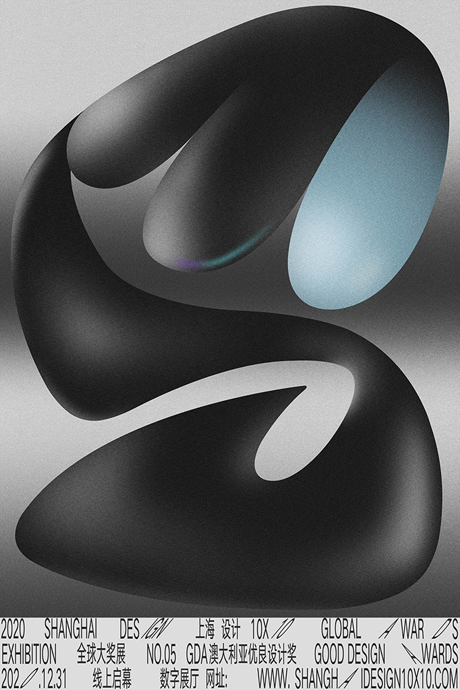
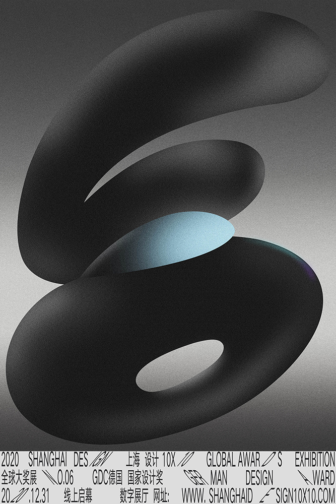
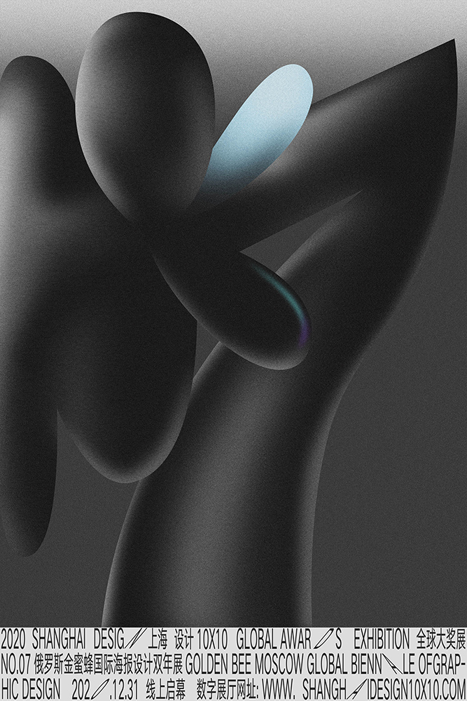
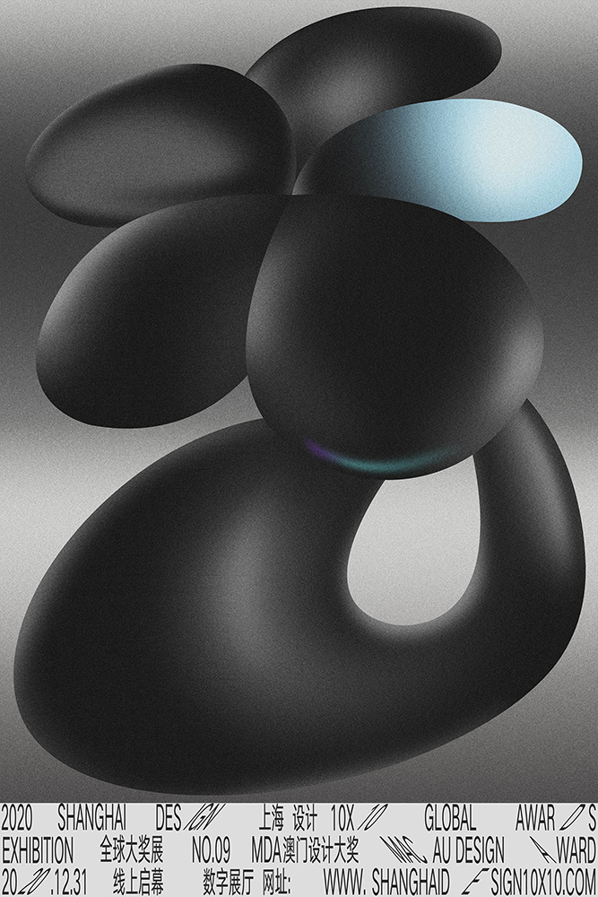
全球大奖展 2022 Shanghai Design 10×10
Global Awards Exhibition


“上海设计10×10”是上海美术学院基于设计学学科使命的“上海设计”概念上建设的展览与交流项目,以“建构平台”“汇聚能量”“相互砥砺”“共创未来”为理念,集结遍布世界各地、历史悠久、跨越大洲、拥有顶级影响力的设计大赛组织及设计机构,每两年内分别举办“上海设计10×10全球大奖展”“上海设计10×10全球设计高峰会”。意在搭建全球设计交流平台,立足上海、放眼全球,提升上海设计之都“上海设计”的全球影响力。通过展览、论坛、工作坊、出版等不同维度,建构连结全球设计“大赛×大奖×大师×大作”的最佳平台,形塑全球设计大奖交流互动的顶级殿堂。同时,与世界顶尖设计大赛组织及设计机构建立合作关系,汇聚全球设计精华。 Based on the mission of the design discipline, Shanghai Academy of Fine Arts has established the exhibition and exchange project of “Shanghai Design 10×10” on the concept of "Shanghai Design". Under the concept of “constructing platform”, “concentrating energy”, “mutually enthusiasm” and “creating the future together”, “Shanghai Design 10×10” gathers design competition organizations and design institutions with worldwide, long-standing, crossing four continents and top influences, and holds “Shanghai Design 10×10 Global Award Exhibition” and “Shanghai Design 10×10 Global Design Summit” every two years. With the base of Shanghai and the global view, the events aim to build an international design exchange platform and enhance the design competitiveness of Shanghai Design Capital. Through exhibitions, forums, publications and other different dimensions, the event is built into the best platform to connect the global design “big competitions, grand prizes, masters, great works”, and has become the top hall for communication and interaction of global design awards. At the same time, “Shanghai Design 10×10” has established cooperative relationships with the world's top design competition organizations and design institutions, bringing together the essence of global design.
“2023上海设计10×10”包含“全球设计高峰会”和“全球设计工作坊”两部分,日期为12月9日-12月12日。 "2023 Shanghai Design 10 ×10" is included two parts: "Global Design Summit" and "Global Design Workshop", with a duration from December 9th to December 12th.
指导单位: 上海大学
主办单位: 上海美术学院
学术指导单位: 上海市创意设计工作者协会
总顾问: 冯远、曾成钢
总策划: 陈青、林磐耸
总协调: 金江波、毛冬华
工作委员会: 陈静、宋国栓、曹俊、翟庆喜、程雪松、章莉莉、王海松
执行总监: 陆丹丹
项目监理: 张璟、蔡文超、成义祺
项目统筹:牛晨光、宋洁、潘敏晔、周红光、董顺琪、卢杨、芮希彦、舒眉、孟小坤、郁竟成、陈静、张晓萍
执行团队: 王蒙、李超、李明星、马俊、宋培铭、章顺凯
工作坊合作导师: 张璟、成义祺、蔡文超、王蒙、李超、乐丽君、宋天颐、马俊、张腾、范佳敏
工作坊助教:黎映川、宋培铭、逸馨、刘颖、刘样、周仁晗、李文婷、朱诗屹、周颖、渠可玚、徐佳仪、吴欣怡
视觉设计&空间设计: 蔡文超 (相对态 Relative State Design)
数字展厅: 梅数植 (702 Design)、李坚
项目助理: 秦方圆、江珊、宋培铭、刘颖、张潇少淇、曹紫璇、王静怡、田济豪、马诗雯、吴妍诺、冯怡然、徐雪桐、吴淑妍、章顺凯
官方媒体:新华网、解放日报、文汇报、新民晚报、新闻晨报、上海教育电视台、中新社、光明网、澎湃新闻、SMG看看新闻
专业媒体:陆俊毅_设计现场、Design360°、hiiibrand、最设计、雅昌网、凃志初自媒体
Guidance unit: Shanghai University
Organizer: Shanghai Academy of Fine Arts
Academic guidance unit: Shanghai Designers Association
General Advisors: Feng Yuan, Zeng Chenggang
Chief Planner: Chen Qing, Apex Lin, Pang-Soong
General Coordinator: Jin Jiangbo, Mao Donghua
Working Committee: Chen Jing, Song Guoshuan, Cao Jun, Zhai Qingxi, Cheng Xuesong, Zhang Lili, Wang Haisong
Executive Director: Lu Dandan
Project Supervision: Zhang Jing, Cai Wenchao, Cheng Yiqi
Project Coordinator: Niu Chenguang, Song Jie, Pan Minye, Zhou Hongguang, Dong Shunqi, Lu Yang, Rui Xiyan, Shu Mei, Meng Xiaokun, Yu Jingcheng, Chen Jing, Zhang Xiaoping
Executive Team: Wang Meng, Li Chao, Li Mingxing, Ma Jun, Song Peiming, Zhang Shunkai
Workshop Collaborating Mentors: Zhang Jing, Cheng Yiqi, Cai Wenchao, Wang Meng, Li Chao, Le Lijun, Song Tianyi, Ma Jun, Zhang Teng, Fan Jiamin
Workshop Assistants: Li Yingchuan, Song Peiming, Yi Xin, Liu Ying, Liu Yang, Zhou Renhan, Li Wenting, Zhu Shiyi, Zhou Ying, Qu Keying, Xu Jiayi, Wu Xinyi
Visual Design & Space Design: Cai Wenchao (Relative State Design)
Digital Exhibition Hall: Mei Shuzhi (702 Design), Li Jian
Project Assistants: Qin Fangyuan, Jiang Shan, Song Peiming, Liu Ying, Zhang Xiaoshaoqi, Cao Zixuan, Wang Jingyi, Tian Jihao, Ma Shiwen, Wu Yannuo, Feng Yiran, Xu Xuetong, Wu Shuyan, Zhang Shunkai
Official media: CCTV, Xinhuanet, Jiefang Daily, Wenhui Daily, Xinmin Evening News, Shanghai Morning Post, SETV, China News, Gmw.cn, ThePaper.cn, SMG Knews
Professional Media: Lu Junyi_ Designlive, Design 360 °, hiiibrand, AD518.com, Atrron.net, Tu Zhichu_ Design We Media
![]()
![]()
上海大学上海美术学院
上海市宝山区上大路99号
310015
联系邮箱
Shanghaisheji@163.com
微信公众号

合作媒体:
![]()
![]()
Shanghai Academy of Fine Arts, 99 Shangda Road, Baoshan District, Shanghai
310015
Contact
Shanghaisheji@163.com
WeChat Official Accounts
Media:
![]()
![]()
![]()
![]()
![]()
凃志初_设计自媒体Tu Zhichu_Design We Media
2023“上海设计 10×10”全球大奖展
最终解释权归“上海设计 10×10 ”组委会所有
The final right of interpretation of the 2023 Shanghai Design 10×10 Global Awards Exhibition belongs to the “Shanghai Design 10×10” Organising Committee.
Global Awards Exhibition
“上海设计10×10”是上海美术学院基于设计学学科使命的“上海设计”概念上建设的展览与交流项目,以“建构平台”“汇聚能量”“相互砥砺”“共创未来”为理念,集结遍布世界各地、历史悠久、跨越大洲、拥有顶级影响力的设计大赛组织及设计机构,每两年内分别举办“上海设计10×10全球大奖展”“上海设计10×10全球设计高峰会”。意在搭建全球设计交流平台,立足上海、放眼全球,提升上海设计之都“上海设计”的全球影响力。通过展览、论坛、工作坊、出版等不同维度,建构连结全球设计“大赛×大奖×大师×大作”的最佳平台,形塑全球设计大奖交流互动的顶级殿堂。同时,与世界顶尖设计大赛组织及设计机构建立合作关系,汇聚全球设计精华。 Based on the mission of the design discipline, Shanghai Academy of Fine Arts has established the exhibition and exchange project of “Shanghai Design 10×10” on the concept of "Shanghai Design". Under the concept of “constructing platform”, “concentrating energy”, “mutually enthusiasm” and “creating the future together”, “Shanghai Design 10×10” gathers design competition organizations and design institutions with worldwide, long-standing, crossing four continents and top influences, and holds “Shanghai Design 10×10 Global Award Exhibition” and “Shanghai Design 10×10 Global Design Summit” every two years. With the base of Shanghai and the global view, the events aim to build an international design exchange platform and enhance the design competitiveness of Shanghai Design Capital. Through exhibitions, forums, publications and other different dimensions, the event is built into the best platform to connect the global design “big competitions, grand prizes, masters, great works”, and has become the top hall for communication and interaction of global design awards. At the same time, “Shanghai Design 10×10” has established cooperative relationships with the world's top design competition organizations and design institutions, bringing together the essence of global design.
“2023上海设计10×10”包含“全球设计高峰会”和“全球设计工作坊”两部分,日期为12月9日-12月12日。 "2023 Shanghai Design 10 ×10" is included two parts: "Global Design Summit" and "Global Design Workshop", with a duration from December 9th to December 12th.
指导单位: 上海大学
主办单位: 上海美术学院
学术指导单位: 上海市创意设计工作者协会
总顾问: 冯远、曾成钢
总策划: 陈青、林磐耸
总协调: 金江波、毛冬华
工作委员会: 陈静、宋国栓、曹俊、翟庆喜、程雪松、章莉莉、王海松
执行总监: 陆丹丹
项目监理: 张璟、蔡文超、成义祺
项目统筹:牛晨光、宋洁、潘敏晔、周红光、董顺琪、卢杨、芮希彦、舒眉、孟小坤、郁竟成、陈静、张晓萍
执行团队: 王蒙、李超、李明星、马俊、宋培铭、章顺凯
工作坊合作导师: 张璟、成义祺、蔡文超、王蒙、李超、乐丽君、宋天颐、马俊、张腾、范佳敏
工作坊助教:黎映川、宋培铭、逸馨、刘颖、刘样、周仁晗、李文婷、朱诗屹、周颖、渠可玚、徐佳仪、吴欣怡
视觉设计&空间设计: 蔡文超 (相对态 Relative State Design)
数字展厅: 梅数植 (702 Design)、李坚
项目助理: 秦方圆、江珊、宋培铭、刘颖、张潇少淇、曹紫璇、王静怡、田济豪、马诗雯、吴妍诺、冯怡然、徐雪桐、吴淑妍、章顺凯
官方媒体:新华网、解放日报、文汇报、新民晚报、新闻晨报、上海教育电视台、中新社、光明网、澎湃新闻、SMG看看新闻
专业媒体:陆俊毅_设计现场、Design360°、hiiibrand、最设计、雅昌网、凃志初自媒体
Guidance unit: Shanghai University
Organizer: Shanghai Academy of Fine Arts
Academic guidance unit: Shanghai Designers Association
General Advisors: Feng Yuan, Zeng Chenggang
Chief Planner: Chen Qing, Apex Lin, Pang-Soong
General Coordinator: Jin Jiangbo, Mao Donghua
Working Committee: Chen Jing, Song Guoshuan, Cao Jun, Zhai Qingxi, Cheng Xuesong, Zhang Lili, Wang Haisong
Executive Director: Lu Dandan
Project Supervision: Zhang Jing, Cai Wenchao, Cheng Yiqi
Project Coordinator: Niu Chenguang, Song Jie, Pan Minye, Zhou Hongguang, Dong Shunqi, Lu Yang, Rui Xiyan, Shu Mei, Meng Xiaokun, Yu Jingcheng, Chen Jing, Zhang Xiaoping
Executive Team: Wang Meng, Li Chao, Li Mingxing, Ma Jun, Song Peiming, Zhang Shunkai
Workshop Collaborating Mentors: Zhang Jing, Cheng Yiqi, Cai Wenchao, Wang Meng, Li Chao, Le Lijun, Song Tianyi, Ma Jun, Zhang Teng, Fan Jiamin
Workshop Assistants: Li Yingchuan, Song Peiming, Yi Xin, Liu Ying, Liu Yang, Zhou Renhan, Li Wenting, Zhu Shiyi, Zhou Ying, Qu Keying, Xu Jiayi, Wu Xinyi
Visual Design & Space Design: Cai Wenchao (Relative State Design)
Digital Exhibition Hall: Mei Shuzhi (702 Design), Li Jian
Project Assistants: Qin Fangyuan, Jiang Shan, Song Peiming, Liu Ying, Zhang Xiaoshaoqi, Cao Zixuan, Wang Jingyi, Tian Jihao, Ma Shiwen, Wu Yannuo, Feng Yiran, Xu Xuetong, Wu Shuyan, Zhang Shunkai
Official media: CCTV, Xinhuanet, Jiefang Daily, Wenhui Daily, Xinmin Evening News, Shanghai Morning Post, SETV, China News, Gmw.cn, ThePaper.cn, SMG Knews
Professional Media: Lu Junyi_ Designlive, Design 360 °, hiiibrand, AD518.com, Atrron.net, Tu Zhichu_ Design We Media
![]()
![]()
上海大学上海美术学院
上海市宝山区上大路99号
310015
联系邮箱
Shanghaisheji@163.com
微信公众号
合作媒体:
![]()
![]()
Shanghai Academy of Fine Arts, 99 Shangda Road, Baoshan District, Shanghai
310015
Contact
Shanghaisheji@163.com
WeChat Official Accounts
Media:
![]()
![]()
![]()
![]()
![]()
凃志初_设计自媒体Tu Zhichu_Design We Media
2023“上海设计 10×10”全球大奖展
最终解释权归“上海设计 10×10 ”组委会所有
The final right of interpretation of the 2023 Shanghai Design 10×10 Global Awards Exhibition belongs to the “Shanghai Design 10×10” Organising Committee.
Ribaasu
Tien-Min Liao
美国
金奖
视觉传达类
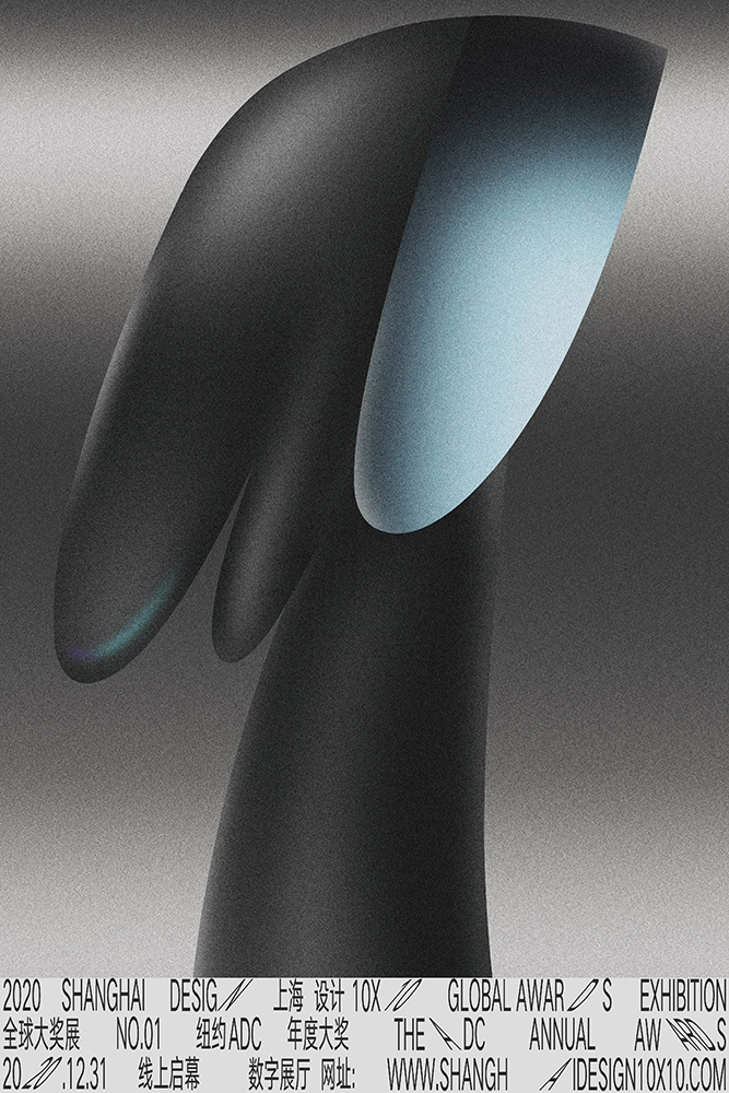
纽约ADC年度大奖
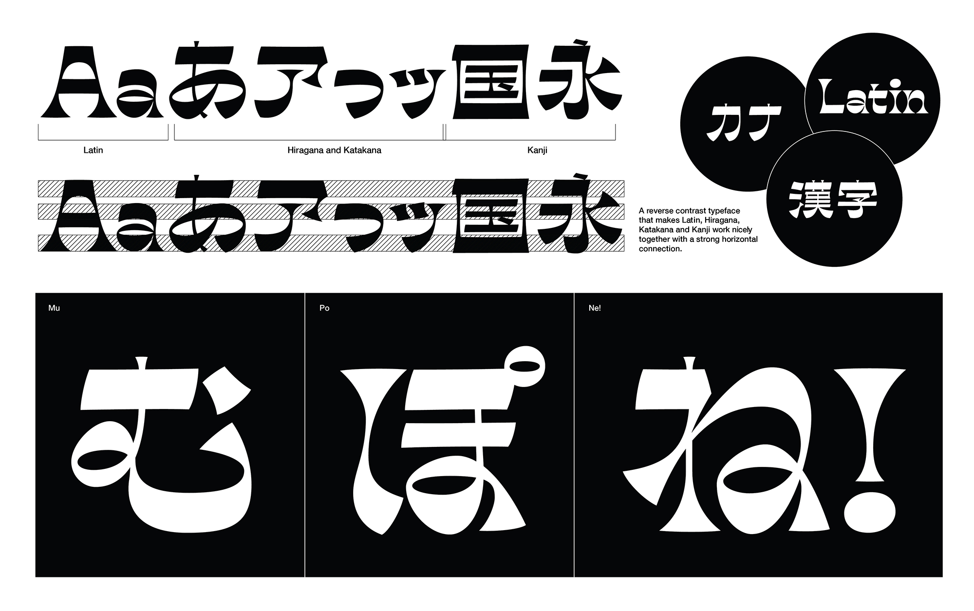
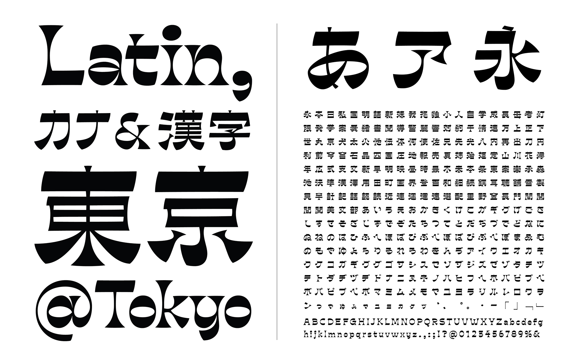
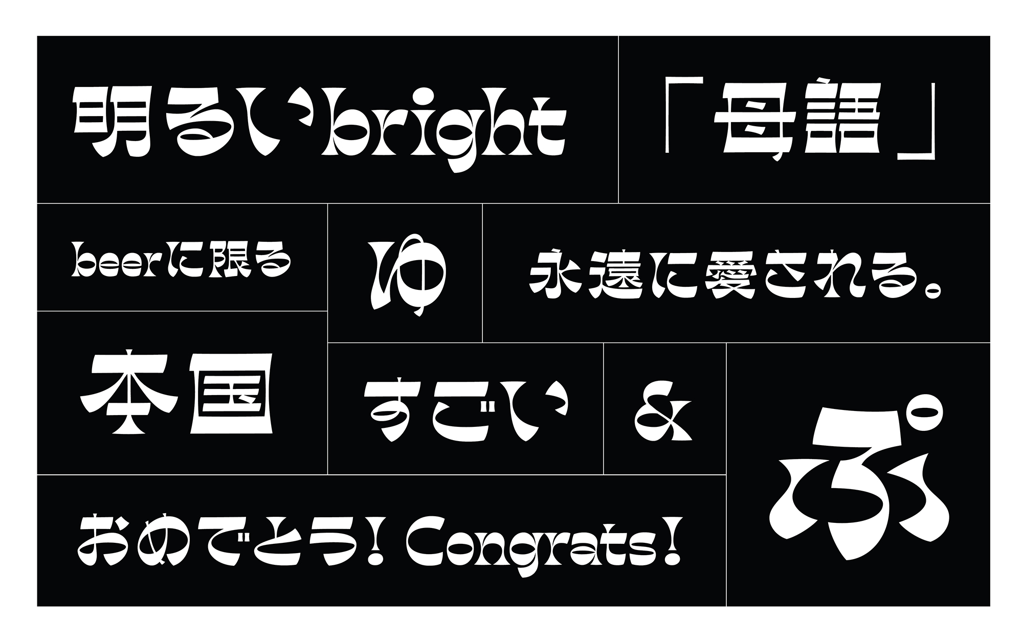
利巴苏:一种多字反对比字体。在标准字体中,垂直的字体通常比水平的字体重。然而,在反对比字体中,正态重量分布是相反的;结果是,重量集中在帽高、x高和基线上,创造了强烈的水平视觉联系。与拉丁字母不同,汉字和假名中的权重分布要复杂得多,而且不只是在垂直的领域。许多笔画是对角线或弯曲的,因此重量分布在不同的笔画上有所不同。简单地颠倒权重分布可能不会产生与拉丁语中相同的视觉结果。我的方法不是从字面上颠倒权重,而是创建一个非拉丁反向对比,以捕捉拉丁反向对比的视觉本质。其本质是古怪的个性和强烈的横向联系,因此,两者可以在视觉上兼容。
Ribaasu
Tien-Min Liao
United States
ADC 99th Gold
Visual Communication Design
The ADC Annual Awards
Ribaasu: A multi-script reverse-contrast typeface. In standard typefaces, verticals are usually heavier than horizontals. However in a reverse-contrast typeface, the normal weight distribution is reversed; the result is that the weight becomes concentrated along the cap-height, x-height and baseline, which creates a strong horizontal visual connection. Unlike the Latin alphabet, the weight distribution in Kanji and Kana are much more complex, and not just on the verticals. Many strokes are diagonal or curved, therefore the weight distribution varies on different strokes. Simply reversing the weight distribution may not create the same visual result as the Latin one. Instead of reversing the weight literally, my approach is to create a non-Latin reverse-contrast in order to capture the visual essence of the Latin reverse-contrast. That essence is the quirky personality and strong horizontal connection, thus, both can work together in a visually compatible way.