全球大奖展 2024 Shanghai Design 10×10
Global Awards Exhibition


“上海设计10×10”是上海美术学院基于设计学学科使命的“上海设计”概念上建设的展览与交流项目,以“建构平台”“汇聚能量”“相互砥砺”“共创未来”为理念,集结遍布世界各地、历史悠久、跨越大洲、拥有顶级影响力的设计大赛组织及设计机构,每两年内分别举办“上海设计10×10全球大奖展”“上海设计10×10国际设计大会”。意在搭建全球设计交流平台,立足上海、放眼全球,提升上海设计之都“上海设计”的全球影响力。通过展览、论坛、工作坊、出版等不同维度,建构连结全球设计“大赛×大奖×大师×大作”的最佳平台,形塑全球设计大奖交流互动的顶级殿堂。同时,与世界顶尖设计大赛组织及设计机构建立合作关系,汇聚全球设计精华。 Based on the mission of the design discipline, Shanghai Academy of Fine Arts has established the exhibition and exchange project of “Shanghai Design 10×10” on the concept of "Shanghai Design". Under the concept of “constructing platform”, “concentrating energy”, “mutually enthusiasm” and “creating the future together”, “Shanghai Design 10×10” gathers design competition organizations and design institutions with worldwide, long-standing, crossing four continents and top influences, and holds “Shanghai Design 10×10 Global Award Exhibition” and “Shanghai Design 10×10 Global Design Summit” every two years. With the base of Shanghai and the global view, the events aim to build an international design exchange platform and enhance the design competitiveness of Shanghai Design Capital. Through exhibitions, forums, publications and other different dimensions, the event is built into the best platform to connect the global design “big competitions, grand prizes, masters, great works”, and has become the top hall for communication and interaction of global design awards. At the same time, “Shanghai Design 10×10” has established cooperative relationships with the world's top design competition organizations and design institutions, bringing together the essence of global design.
主办单位:上海大学、上海市创意设计工作者协会
承办单位:上海美术学院
总顾问:冯远
总策划:曾成钢
学术主持:金江波
工作委员会主任:陈静、丁设
工作委员会副主任 ( 按姓氏笔划顺序):丁乙、丁伟、毛冬华、王海松、
杜守帅、宋国栓、何根祥、李谦升、徐军、曹俊、章莉莉、程雪松、翟庆喜
执行策划:陆丹丹
项目监理:张璟、成义祺
执行团队: 李明星、王蒙、张红红、赵璟珩、李孟洋、宋培铭
项目统筹:牛晨光、戴颖、许萍、宋洁、潘敏晔、卢杨、舒眉、董顺琪、郁竟成
刘雪梅、孙玉兰、周红光、陈静、黄涛、孟小坤、郑曲曲、吴澎宵、王迪
视觉设计&空间设计:蔡文超 ( 相对态 Relative State Design )
数字展厅:李坚
项目助理:许家骏、林思彤、姚静怡、张籍予、徐雪桐、吴淑妍、李诗璇、崔慕容、Gofaone Ngewa、李美卿 SEM ALISALEN、Gugulethu Ndlovu、安梅 Anna-Maiji Katriina Rissanen、陆怡嘉、郑奕涵、王何婧茜、顾悦越、庄王媛、徐可、栾景钰、崔佑荣、李安娜Lim Anna、张洪烨、王一晨、刘亭、杨一嘉、吴艿珊、刘蔚、Karpova Sofya、陈羽欣
Hosts: Shanghai University, Shanghai Designers Association
Organizers: Shanghai Academy of Fine Arts
Chief Consultant: Feng Yuan
Chief Planner: Zeng Chenggang
Academic Host: Jin Jiangbo
Chairperson of the Work Committee: Chen Jing, Ding She
Deputy Director of the Working Committee (in order of surname stroke count): Ding Yi, Ding Wei, Mao Donghua, Wang Haisheng
Du Shoushuai, Song Guoshuan, He Genxiang, Li Qiansheng, Xu Jun, Cao Jun, Zhang Lili, Cheng Xuesong, Zhai Qingxi
Executive Planner: Lu Dandan
Project Supervision: Zhang Jing, Cheng Yiqi
Execution Team: Li Mingxing, Wang Meng, Zhang Honghong, Zhao Jingheng, Li Mengyang, Song Peiming
Project Coordination: Niu Chenguang, Dai Ying, Xu Ping, Song Jie, Pan Minye, Lu Yang, Shu Mei, Dong Shunqi, Yu Jingcheng
Liu Xuemei, Sun Yulan, Zhou Hongguang, Chen Jing, Huang Tao, Meng Xiaokun, Zheng Ququ, Wu Pengxiao, Wang Di
Visual Design & Spatial Design: Cai Wenchao (Relative State Design)
Digital Exhibition Hall: Li Jian
Project Assistants: Xu Jiajun, Lin Sitong, Yao Jingyi, Zhang Jiyu, Xu Xuetong, Wu Shuyan, Li Shixuan, Cui Murong, Gofaone Ngewa, Li Meiqing SEM ALISALEN, Gugulethu Ndlovu, An Mei Anna-Maiji Katriina Rissanen, Lu Yijia, Zheng Yihan, Wang Hejingqian, Gu Yuheyue, Zhuang Wangyuan, Xu Ke, Luan Jingyu, Cui Yourong, Li Anna Lim Anna, Zhang Hongye, Wang Yichen, Liu Ting, Yang Yijia, Wu Nanshan, Liu Wei, Karpova Sofya, Chen Yuxin
![]()
![]()
上海大学上海美术学院
上海市宝山区上大路99号
310015
联系邮箱
Shanghaisheji@163.com
微信公众号

合作媒体:
![]()
![]()
Shanghai Academy of Fine Arts, 99 Shangda Road, Baoshan District, Shanghai
310015
Contact
Shanghaisheji@163.com
WeChat Official Accounts
Media:
![]()
![]()
![]()
![]()
![]()
凃志初_设计自媒体Tu Zhichu_Design We Media
2023“上海设计 10×10”全球大奖展
最终解释权归“上海设计 10×10 ”组委会所有
The final right of interpretation of the 2023 Shanghai Design 10×10 Global Awards Exhibition belongs to the “Shanghai Design 10×10” Organising Committee.
Global Awards Exhibition
“上海设计10×10”是上海美术学院基于设计学学科使命的“上海设计”概念上建设的展览与交流项目,以“建构平台”“汇聚能量”“相互砥砺”“共创未来”为理念,集结遍布世界各地、历史悠久、跨越大洲、拥有顶级影响力的设计大赛组织及设计机构,每两年内分别举办“上海设计10×10全球大奖展”“上海设计10×10全球设计高峰会”。意在搭建全球设计交流平台,立足上海、放眼全球,提升上海设计之都“上海设计”的全球影响力。通过展览、论坛、工作坊、出版等不同维度,建构连结全球设计“大赛×大奖×大师×大作”的最佳平台,形塑全球设计大奖交流互动的顶级殿堂。同时,与世界顶尖设计大赛组织及设计机构建立合作关系,汇聚全球设计精华。 Based on the mission of the design discipline, Shanghai Academy of Fine Arts has established the exhibition and exchange project of “Shanghai Design 10×10” on the concept of "Shanghai Design". Under the concept of “constructing platform”, “concentrating energy”, “mutually enthusiasm” and “creating the future together”, “Shanghai Design 10×10” gathers design competition organizations and design institutions with worldwide, long-standing, crossing four continents and top influences, and holds “Shanghai Design 10×10 Global Award Exhibition” and “Shanghai Design 10×10 Global Design Summit” every two years. With the base of Shanghai and the global view, the events aim to build an international design exchange platform and enhance the design competitiveness of Shanghai Design Capital. Through exhibitions, forums, publications and other different dimensions, the event is built into the best platform to connect the global design “big competitions, grand prizes, masters, great works”, and has become the top hall for communication and interaction of global design awards. At the same time, “Shanghai Design 10×10” has established cooperative relationships with the world's top design competition organizations and design institutions, bringing together the essence of global design.
“2023上海设计10×10”包含“全球设计高峰会”和“全球设计工作坊”两部分,日期为12月9日-12月12日。 "2023 Shanghai Design 10 ×10" is included two parts: "Global Design Summit" and "Global Design Workshop", with a duration from December 9th to December 12th.
主办单位:上海大学、上海市创意设计工作者协会
承办单位:上海美术学院
总顾问:冯远
总策划:曾成钢
学术主持:金江波
工作委员会主任:陈静、丁设
工作委员会副主任 ( 按姓氏笔划顺序):丁乙、丁伟、毛冬华、王海松、
杜守帅、宋国栓、何根祥、李谦升、徐军、曹俊、章莉莉、程雪松、翟庆喜
执行策划:陆丹丹
项目监理:张璟、成义祺
执行团队: 李明星、王蒙、张红红、赵璟珩、李孟洋、宋培铭
项目统筹:牛晨光、戴颖、许萍、宋洁、潘敏晔、卢杨、舒眉、董顺琪、郁竟成
刘雪梅、孙玉兰、周红光、陈静、黄涛、孟小坤、郑曲曲、吴澎宵、王迪
视觉设计&空间设计:蔡文超 ( 相对态 Relative State Design )
数字展厅:李坚
项目助理:许家骏、林思彤、姚静怡、张籍予、徐雪桐、吴淑妍、李诗璇、崔慕容、Gofaone Ngewa、李美卿 SEM ALISALEN、Gugulethu Ndlovu、安梅 Anna-Maiji Katriina Rissanen、陆怡嘉、郑奕涵、王何婧茜、顾悦越、庄王媛、徐可、栾景钰、崔佑荣、李安娜Lim Anna、张洪烨、王一晨、刘亭、杨一嘉、吴艿珊、刘蔚、Karpova Sofya、陈羽欣
Hosts: Shanghai University, Shanghai Designers Association
Organizers: Shanghai Academy of Fine Arts
Chief Consultant: Feng Yuan
Chief Planner: Zeng Chenggang
Academic Host: Jin Jiangbo
Chairperson of the Work Committee: Chen Jing, Ding She
Deputy Director of the Working Committee (in order of surname stroke count): Ding Yi, Ding Wei, Mao Donghua, Wang Haisheng
Du Shoushuai, Song Guoshuan, He Genxiang, Li Qiansheng, Xu Jun, Cao Jun, Zhang Lili, Cheng Xuesong, Zhai Qingxi
Executive Planner: Lu Dandan
Project Supervision: Zhang Jing, Cheng Yiqi
Execution Team: Li Mingxing, Wang Meng, Zhang Honghong, Zhao Jingheng, Li Mengyang, Song Peiming
Project Coordination: Niu Chenguang, Dai Ying, Xu Ping, Song Jie, Pan Minye, Lu Yang, Shu Mei, Dong Shunqi, Yu Jingcheng
Liu Xuemei, Sun Yulan, Zhou Hongguang, Chen Jing, Huang Tao, Meng Xiaokun, Zheng Ququ, Wu Pengxiao, Wang Di
Visual Design & Spatial Design: Cai Wenchao (Relative State Design)
Digital Exhibition Hall: Li Jian
Project Assistants: Xu Jiajun, Lin Sitong, Yao Jingyi, Zhang Jiyu, Xu Xuetong, Wu Shuyan, Li Shixuan, Cui Murong, Gofaone Ngewa, Li Meiqing SEM ALISALEN, Gugulethu Ndlovu, An Mei Anna-Maiji Katriina Rissanen, Lu Yijia, Zheng Yihan, Wang Hejingqian, Gu Yuheyue, Zhuang Wangyuan, Xu Ke, Luan Jingyu, Cui Yourong, Li Anna Lim Anna, Zhang Hongye, Wang Yichen, Liu Ting, Yang Yijia, Wu Nanshan, Liu Wei, Karpova Sofya, Chen Yuxin
![]()
![]()
上海大学上海美术学院
上海市宝山区上大路99号
310015
联系邮箱
Shanghaisheji@163.com
微信公众号
合作媒体:
![]()
![]()
Shanghai Academy of Fine Arts, 99 Shangda Road, Baoshan District, Shanghai
310015
Contact
Shanghaisheji@163.com
WeChat Official Accounts
Media:
![]()
![]()
![]()
![]()
![]()
凃志初_设计自媒体Tu Zhichu_Design We Media
2023“上海设计 10×10”全球大奖展
最终解释权归“上海设计 10×10 ”组委会所有
The final right of interpretation of the 2023 Shanghai Design 10×10 Global Awards Exhibition belongs to the “Shanghai Design 10×10” Organising Committee.
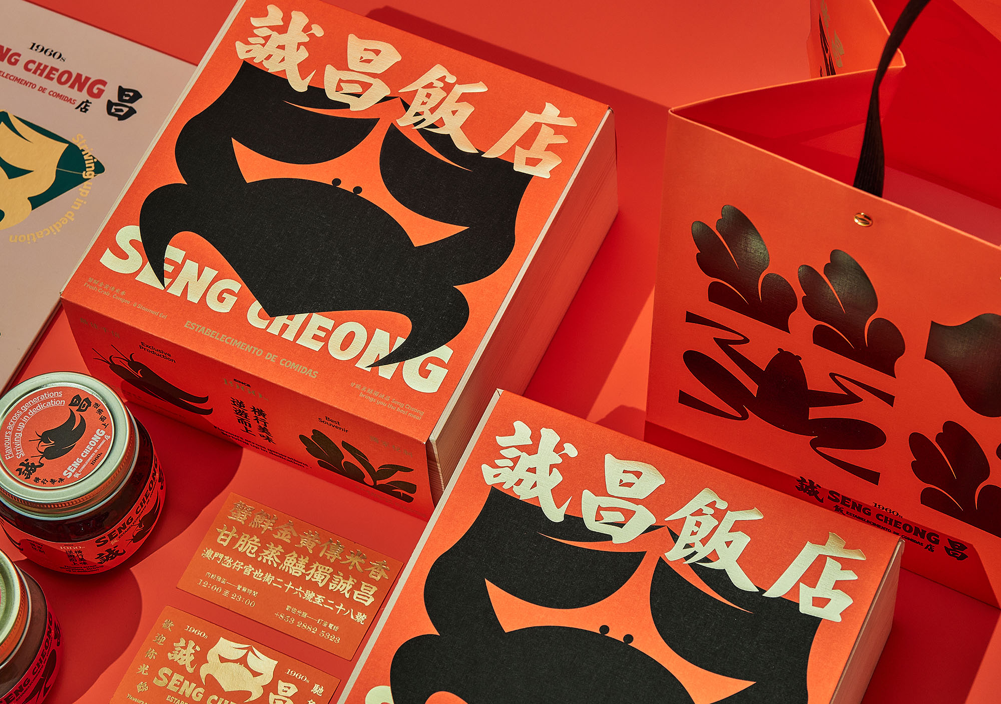
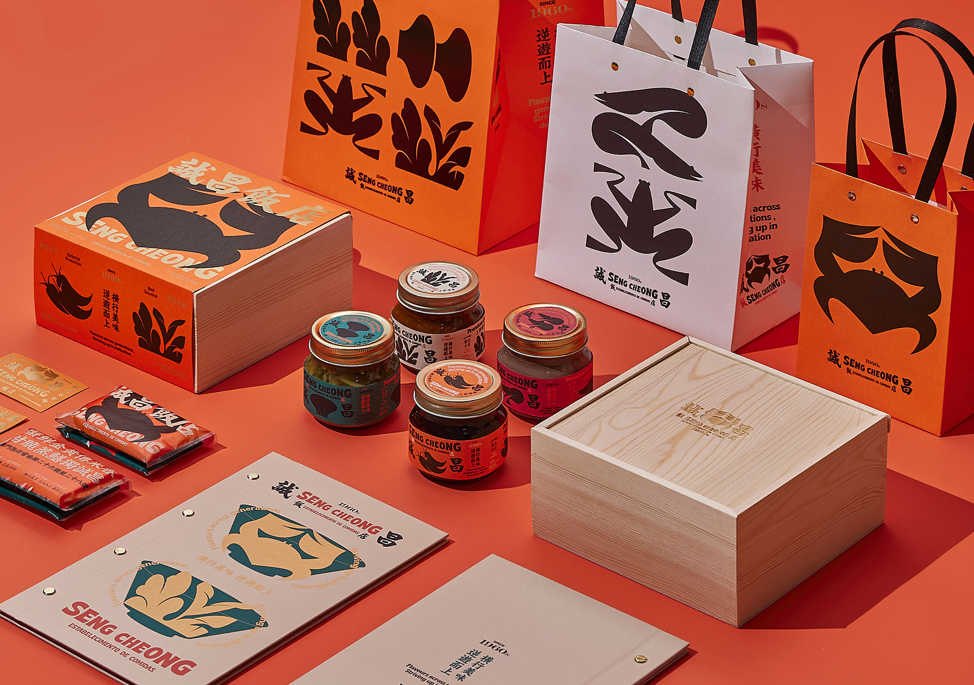
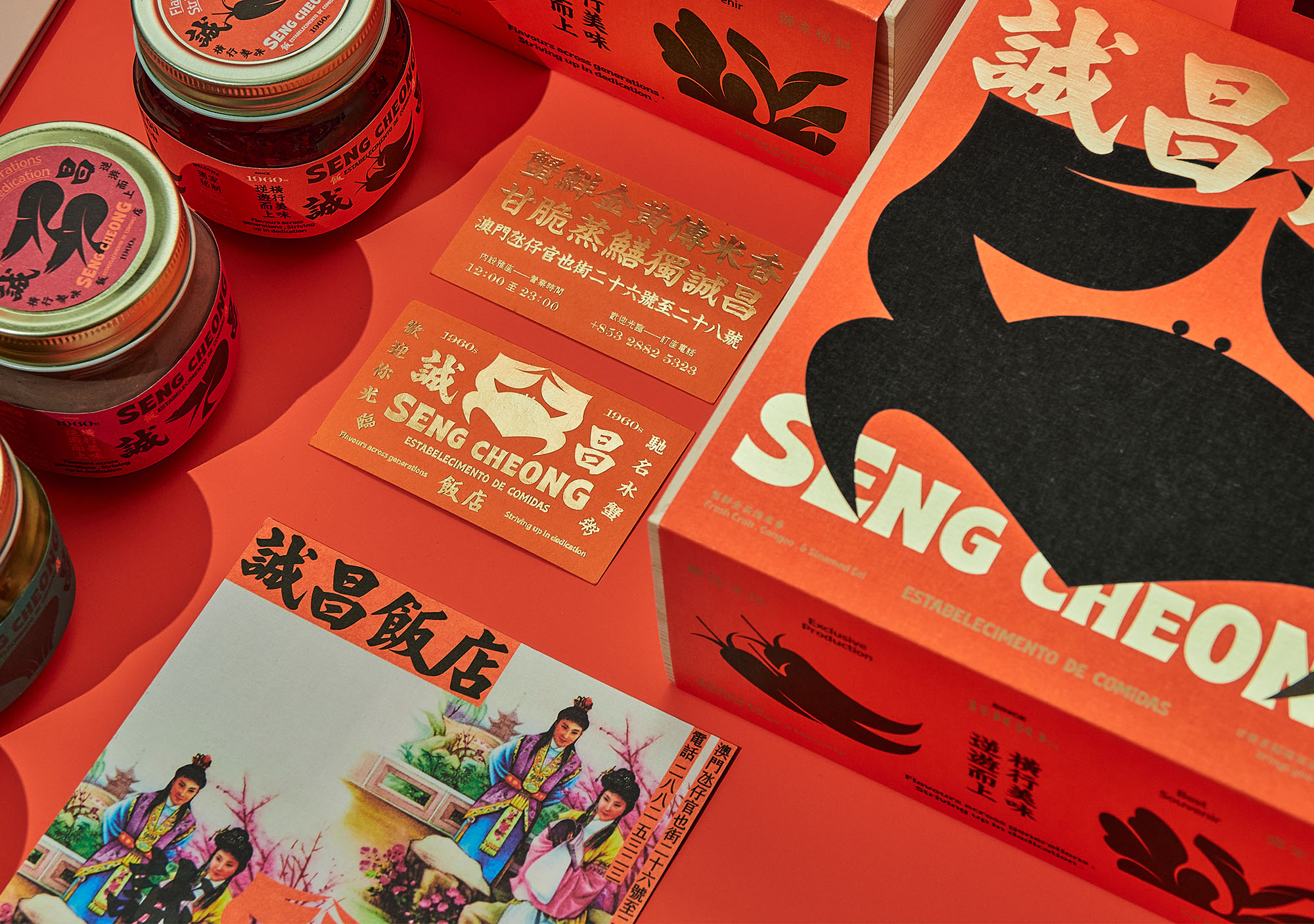
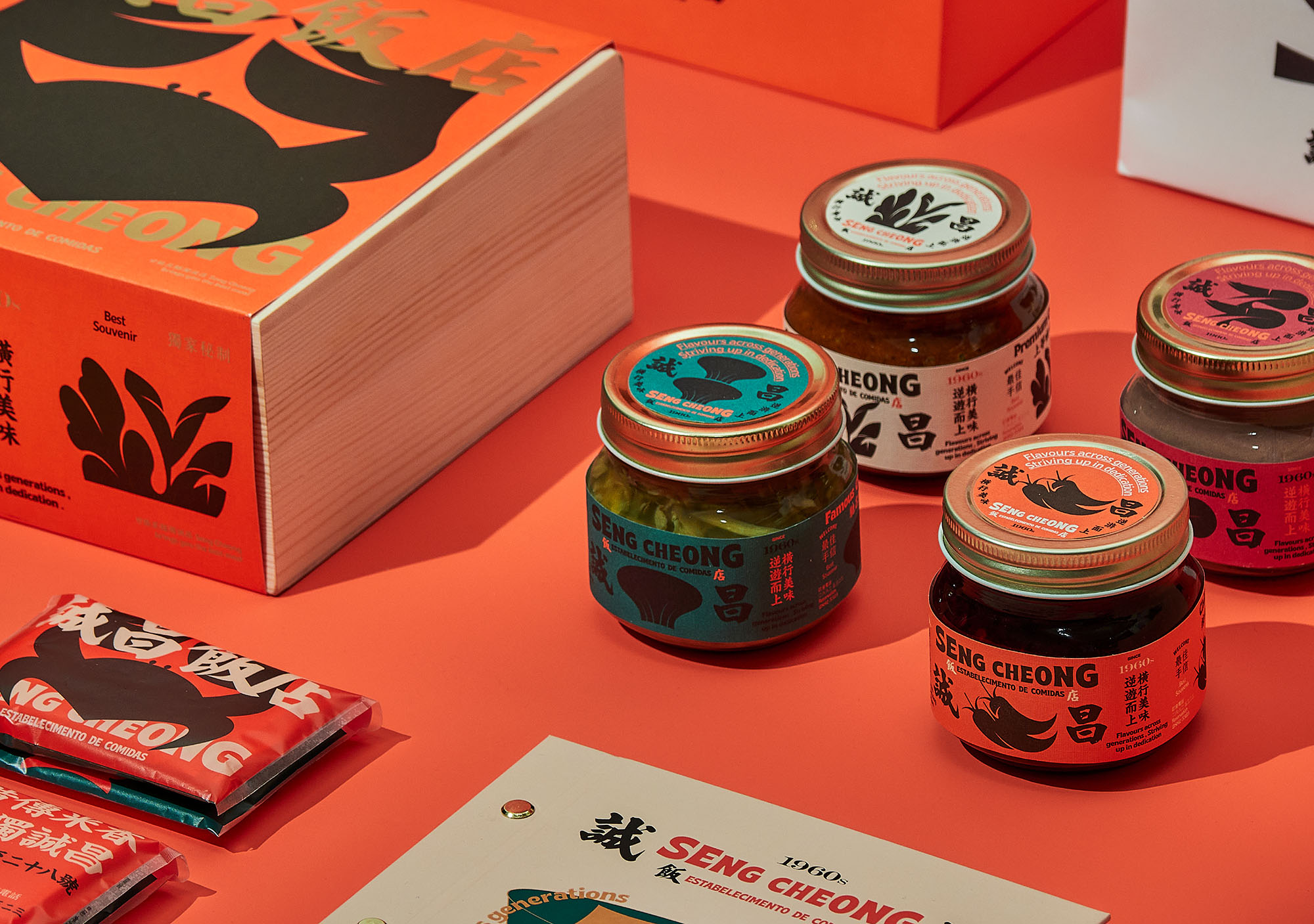
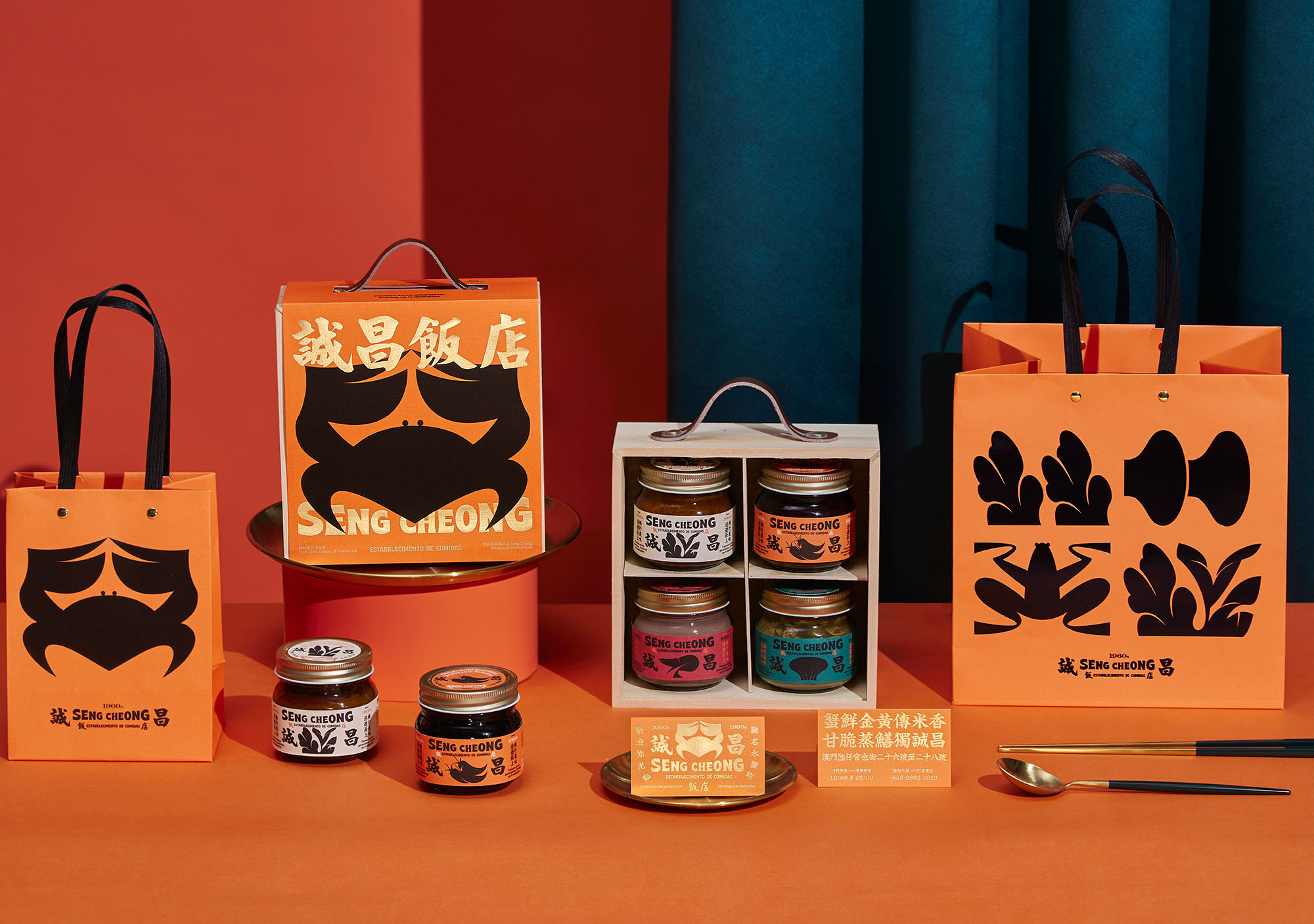
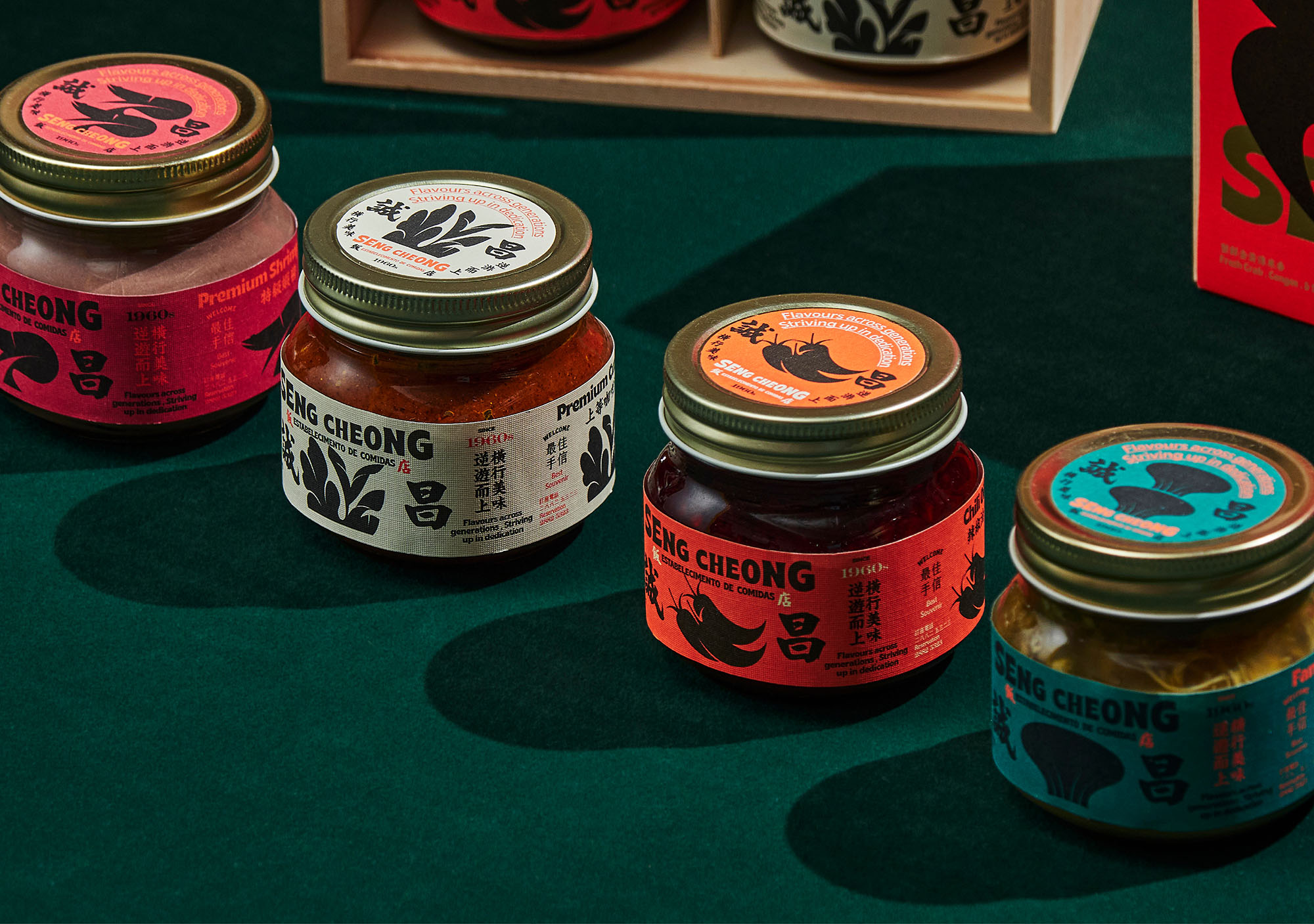
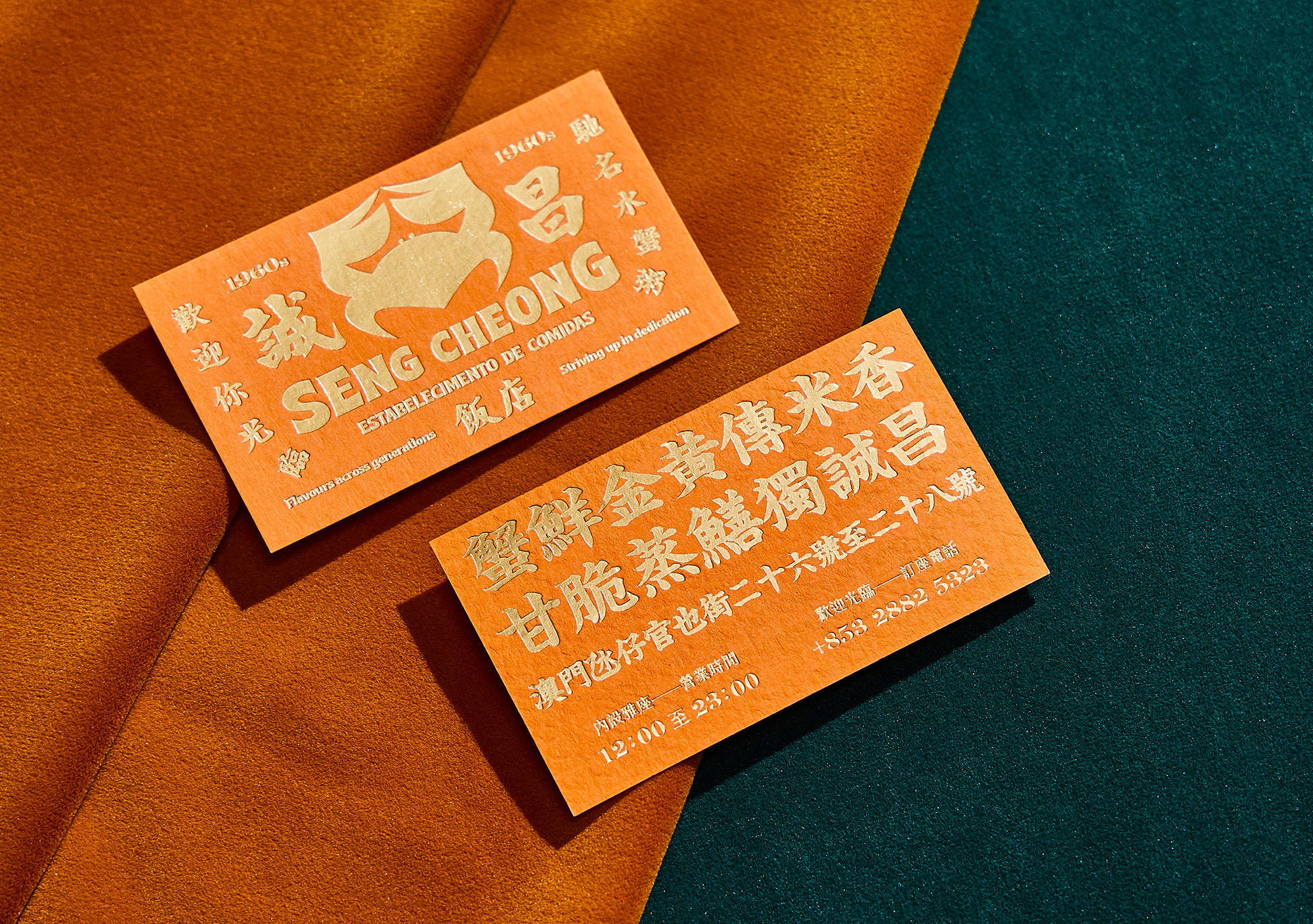
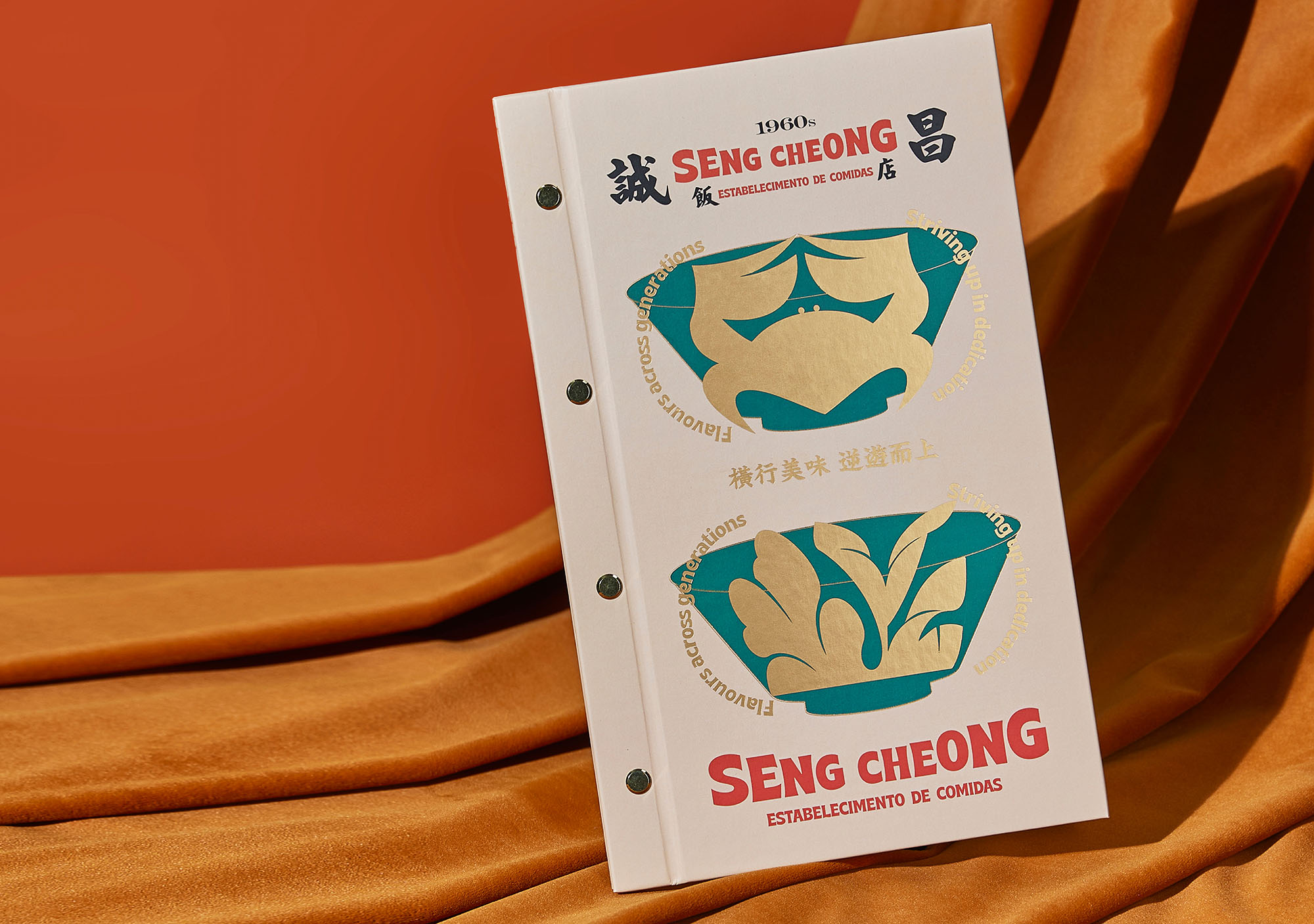
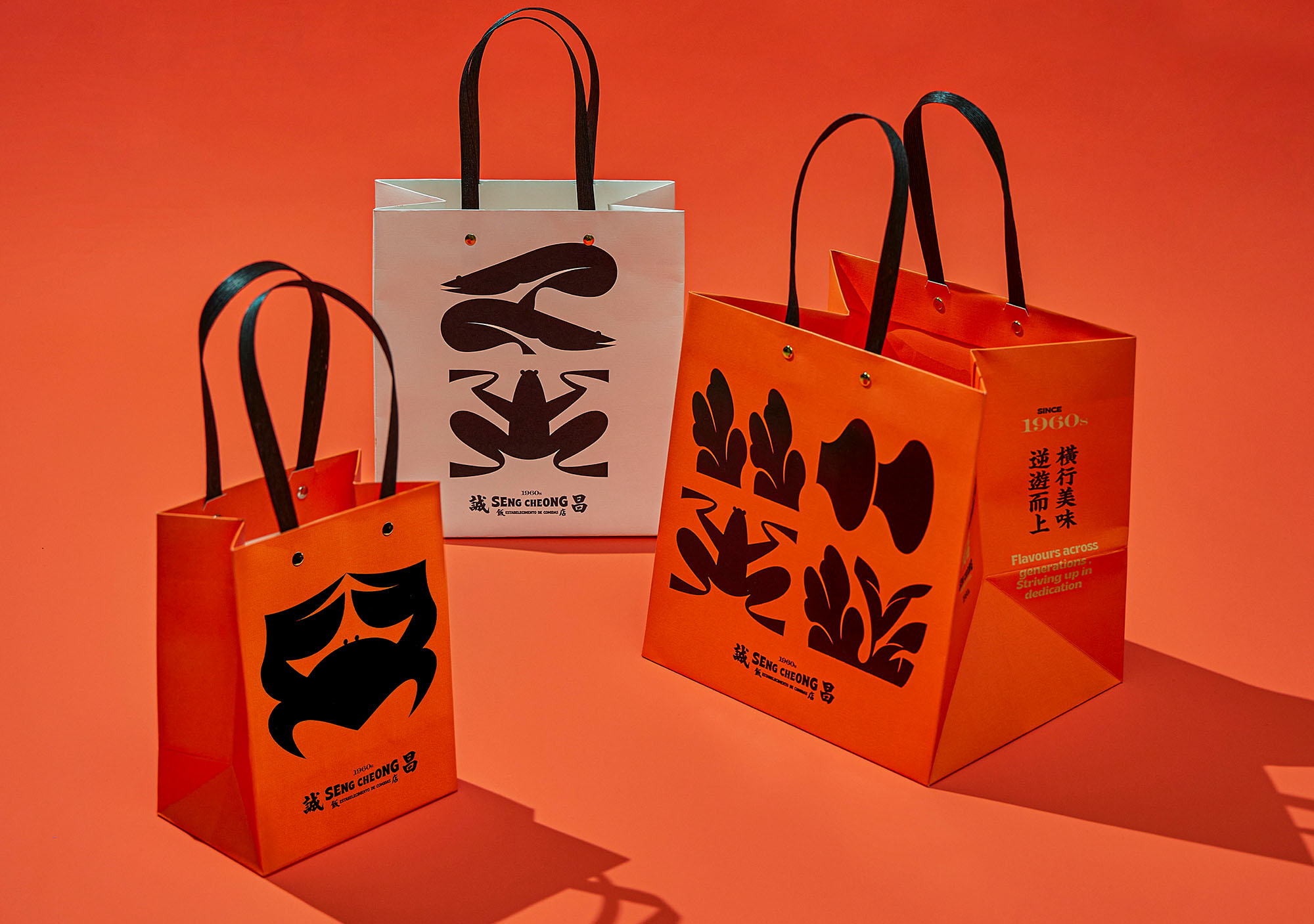
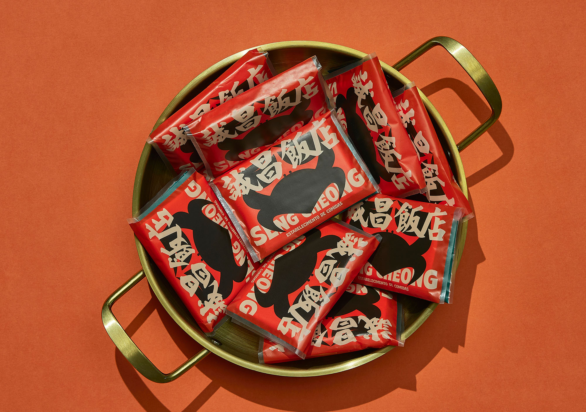
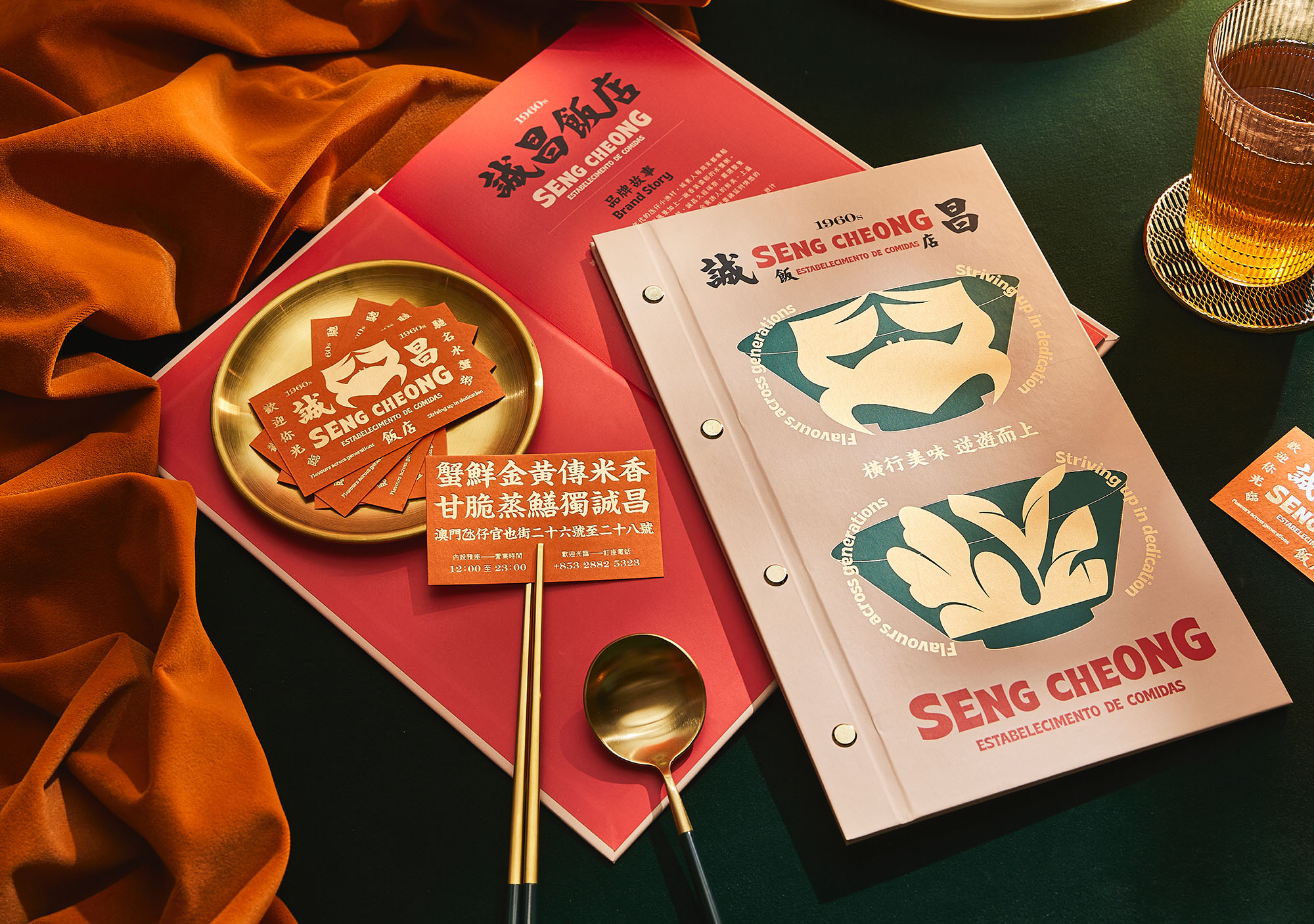
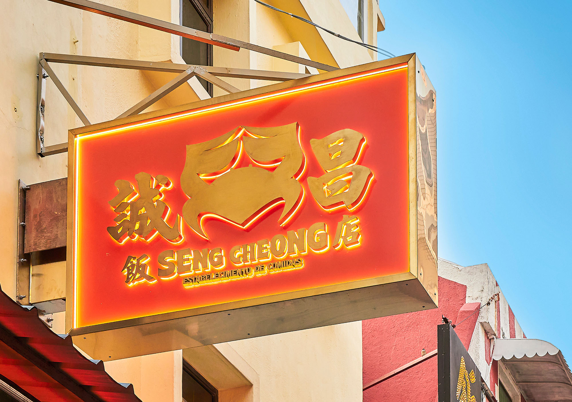
诚昌餐厅品牌重塑
欧俊轩/未名澳门
中国澳门
银奖
品牌/视觉传达设计
纽约ADC年度大奖
2022
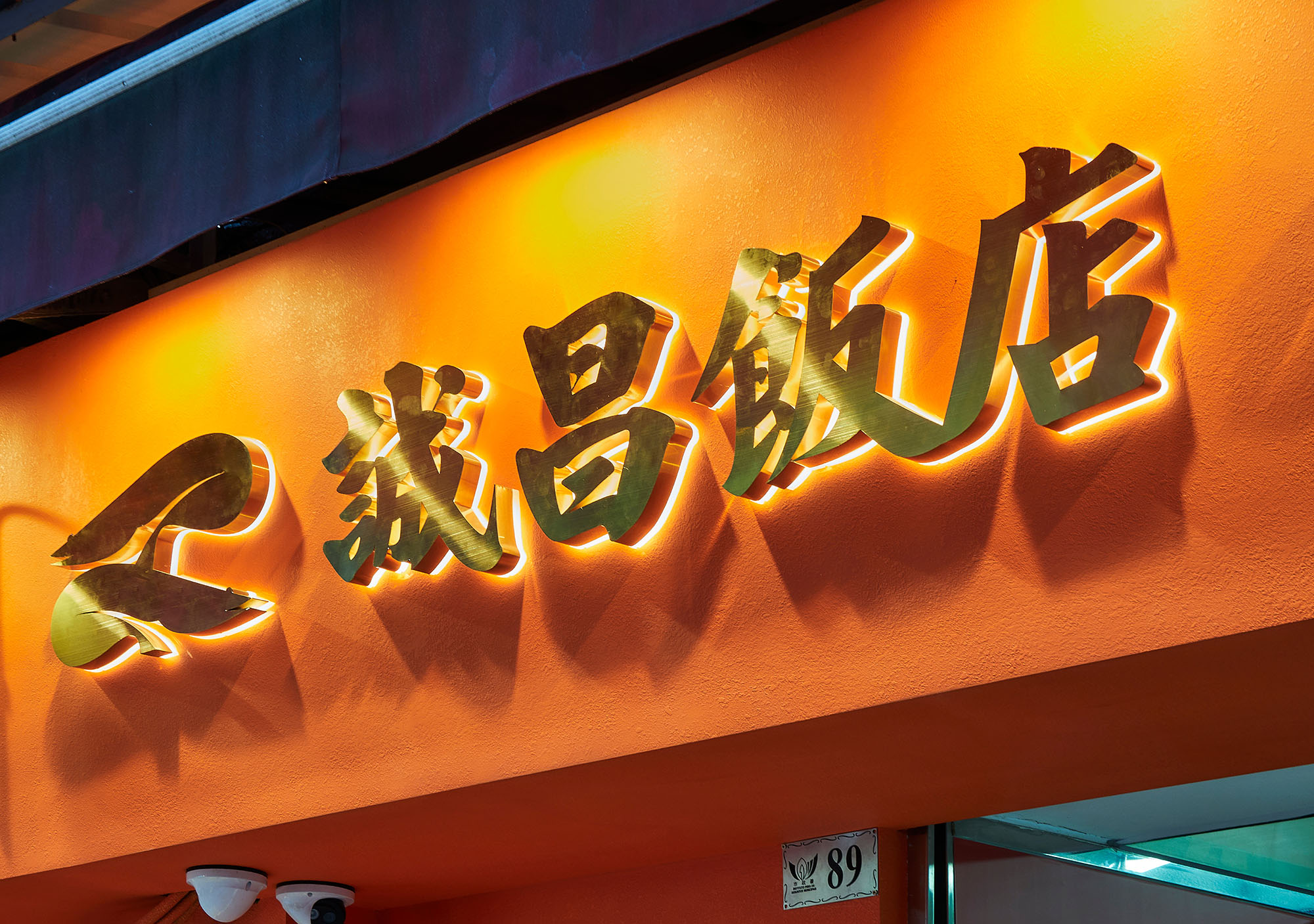
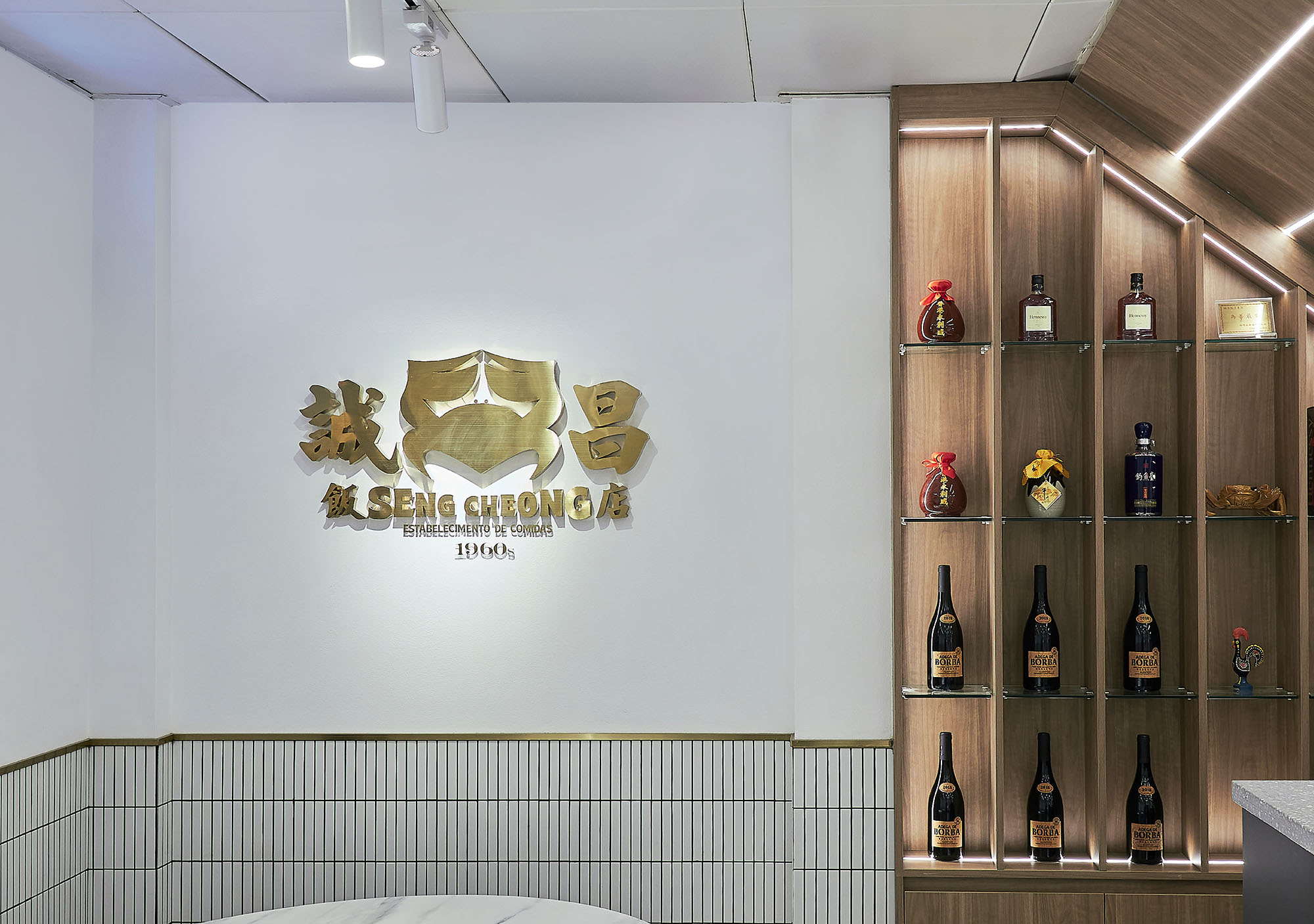
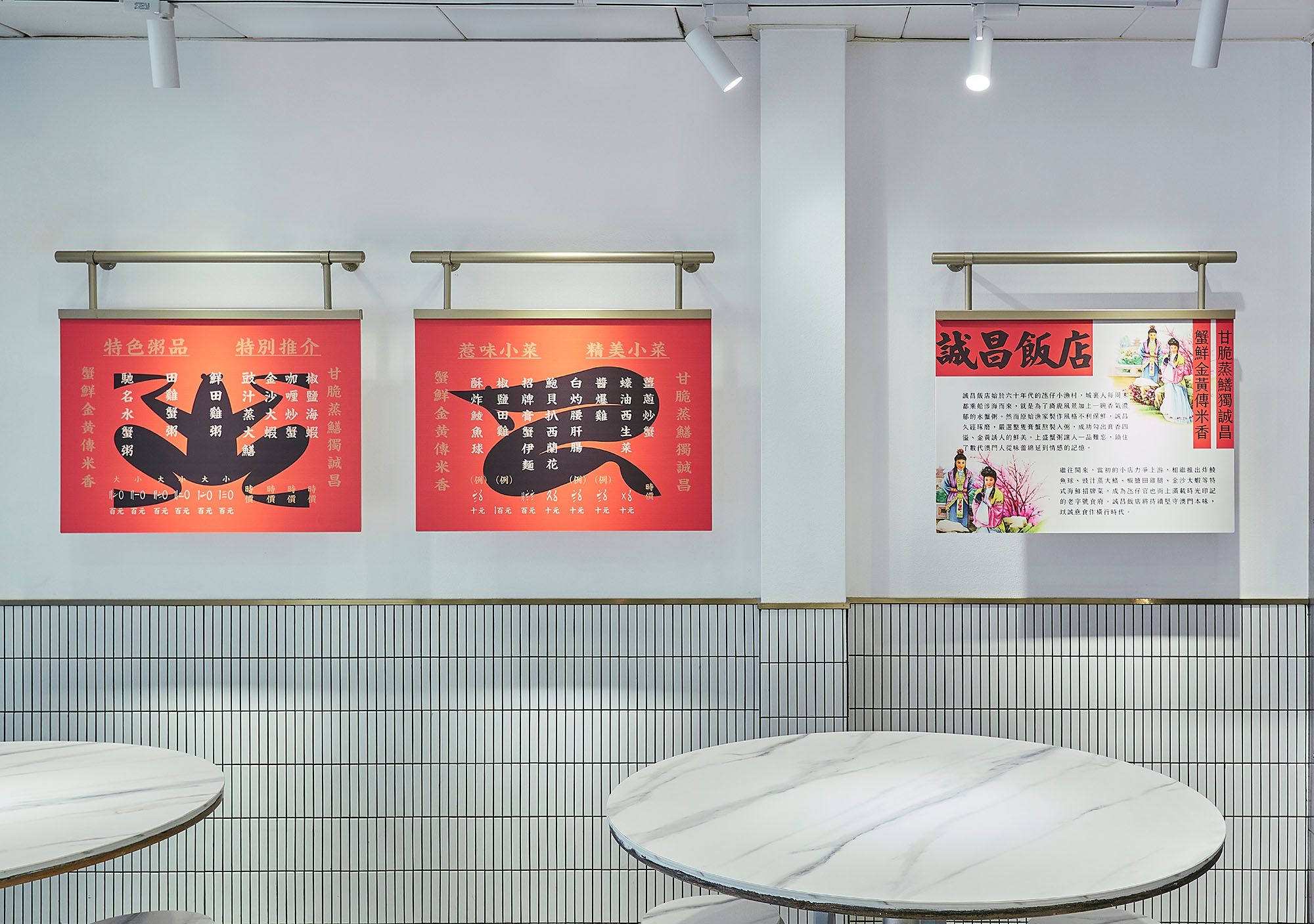
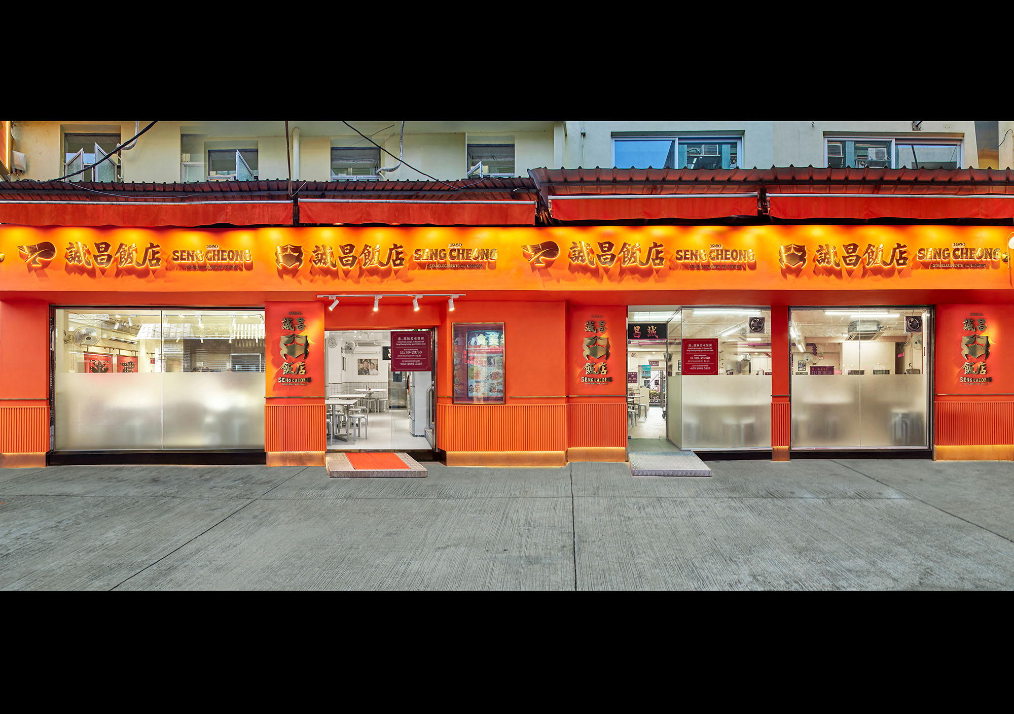
诚昌餐厅的标志设计采用了更直接的表达方式,使用强烈的螃蟹作为图形符号来设置整个品牌的基调。自20世纪60年代以来,诚昌已在小渔村氹仔岛扎根,它以螃蟹粥为主打菜品。这个标志便是为了深化和强化诚昌与螃蟹粥在食客脑海中的绑定。诚昌蟹不再是一个模糊的概念,而是一个具体的文化符号和传承标记。螃蟹的形象采用了描绘金色边缘的方法,使螃蟹在视觉上更加强大。在平面设计中使用金属材料已成为近年来品牌和产品设计的趋势。它突出了奢华和优雅,部分使用金属纹理创造出一种轻奢华的感觉,并增强诚昌的品牌色调。徽标使用红和绿作为涂鸦文字的主颜色。与中国传统美学一样,红色和绿色的结合是最有力和最具代表性的配色方案,强调了诚昌作为一家中餐厅,以及一种已经传承了半个世纪的历史意义;此外,红色代表活力和团结,这也是诚昌想向公众传达的“阮多村的互助精神”。绿色代表自然和健康,这表明诚昌精心挑选产品,用心为顾客烹制蟹肉粥。“诚昌”二字使用传统书法字体,以保持诚昌的原始魅力。它使诚昌更具历史性,并再次强调了诚昌的中国风格。
Seng Cheong Restaurant Rebranding
AU CHON HIN / UNTITLED MACAO
Macau, China
Silver
Brand / Communication Design
ADC Annual Awards
2022
The logo design of SengCheong Restaurant adopts a more direct expression, using a strong crab as a graphic symbol to set the tone of the entire brand. Since the 1960s, SengCheong has planted its root in the small fishing village of Taipa. It starts-up made a sign with crab congee, and Macau crab congee is well-known all over the world due to the continuous improvement and refinement of SengCheong for decades. They have been bound together in diners’ mind, and this logo is to deepen and strengthen this concept. SengCheong Crab is no longer a vague concept, but a concrete cultural symbol and inheritance mark. The image of the crab adopts depicting the golden edge to make the crab visually stronger. Using metal materials in graphic design has become the trend of brand and product design in recent years. It highlights the luxury and elegance, using the metal texture partially would create a sense of light luxury and enhance the brand tonality of SengCheong. The Logo uses red and green as the color of main graffiti text. As in the traditional Chinese aesthetics, the combination of red and green is the most powerful and representative color scheme, emphasizing SengCheong as a Chinese Restaurant, and a sense of historical significance that has been passed down for half a century; moreover, red represents vitality and unity, which is also " the Mutual Helping Spirit of Rua do Cunha" that SengCheong wants to convey to the public. Green represents nature and health, which indicates that SengCheong carefully selects the products and puts heart into cooking crab congee for customers. The text of SengCheong keeps using calligraphy font of the original signboard to maintain the original charm of SengCheong. It makes SengCheong more historic and emphasizes the Chinese style of SengCheong again.